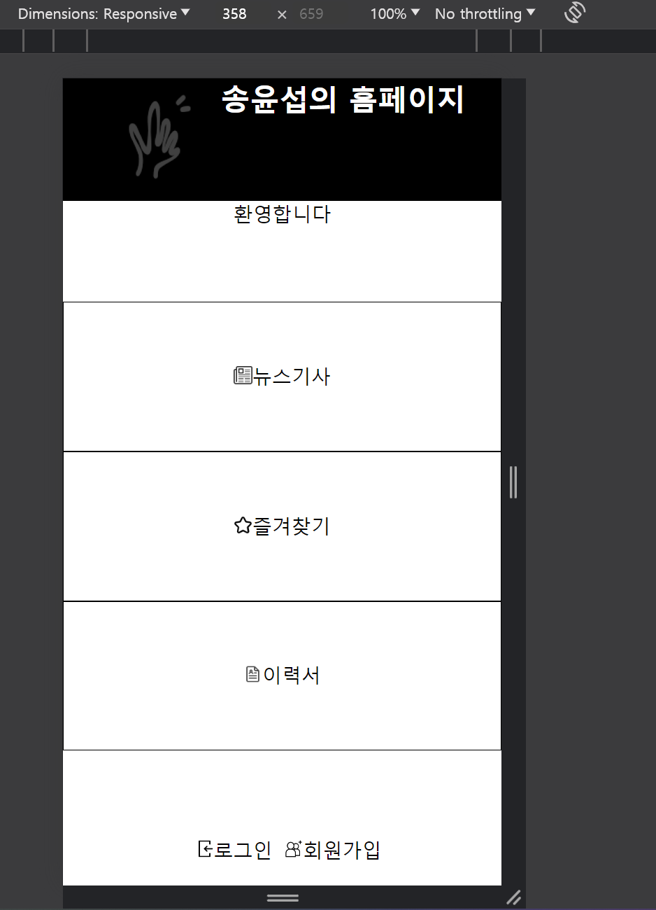
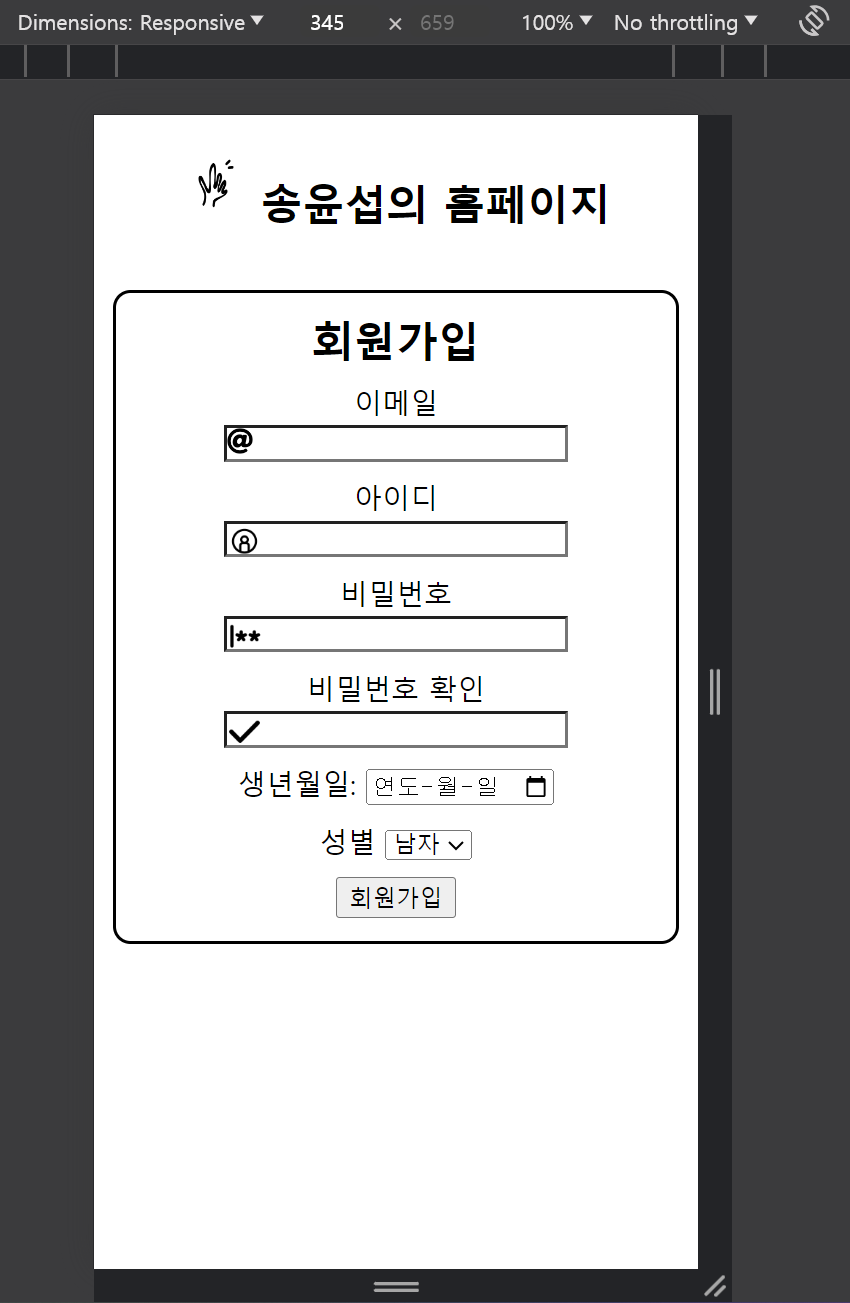
홈페이지를 css 미디어 쿼리를 이용해 모바일 환경을 만들어 보았다
메인페이지 css
@font-face {
    font-family: 'Pretendard-Regular';
    src: url('https://cdn.jsdelivr.net/gh/Project-Noonnu/noonfonts_2107@1.1/Pretendard-Regular.woff') format('woff');
    font-weight: 400;
    font-style: normal;
}
* {
    margin: 0;
    padding: 0;
}

header {
    display: flex;
    width: 100%;
    background-color: black;
    color: white;
}

header > img {
    filter: opacity(0.5) drop-shadow(0 0 0 #FFF);
}


nav {
    display: flex;
    justify-content: center;
    width: 100%;
    flex-wrap: nowrap;
}

nav > ul {
    width: 100%px;
    list-style: none;
    border: 1px solid;
    padding: 0;
}

nav > ul > li {
    display: inline-block;
    margin: 0px 20px;
}

#news:hover {
    background-color: skyblue;
}

#favorite:hover {
    background-color: skyblue;
}

#resume:hover {
    background-color: skyblue;
}

a {
    color: black;
}

a:visited {
    text-decoration: none;
    color: none;
}

a:link {
    color: none;
    text-decoration: none;
}

a:active {
    color: none;
}

#login {
    list-style: none;
    display: flex;
    padding: 10px;
    margin-left: 10px;
}
#login > li {
    margin-left: 10px;
}
#login > li > a:hover {
    color: skyblue;
}

.index{
    display: flexbox;
    justify-content: center;

}

@media screen and (max-width: 480px) {
    * {
        box-sizing: border-box;
    }
    html, body {
        height: 100%;
        width: 100%;
        padding: 0;
        margin: 0;
    }

    #container {
        display: flex;
        flex-direction: column;
        justify-content: space-between;
        height: 100%
    }
    #contents {
        height: 100%;
    }

    nav {
        display: flex;
        flex-direction: column;
        justify-content: center;
        height: 100%;
    }
    nav > ul {
        display: flex;
        flex-direction: column;
        justify-content: center;
        border: none;
        height: 100%;

    }
    nav > ul > li {
        width: 100%;
        margin: 0;
        text-align: center;
        padding: 50px 0px;
        box-sizing: border-box;
        border: 1px solid black;
    }


    #login {
        width: 100%;
        height: 60px;
        margin: 0 auto;
        position: relative;
        transform: translateY(0%);
    }

}
뉴스페이지 css
@font-face {
    font-family: 'Pretendard-Regular';
    src: url('https://cdn.jsdelivr.net/gh/Project-Noonnu/noonfonts_2107@1.1/Pretendard-Regular.woff') format('woff');
    font-weight: 400;
    font-style: normal;
}

header {
    display: flex;
    width: 100%;
    background-color: black;
    color: white;
}

html, body {
    margin: 0;
    padding: 0;
    width: 100%;
    height: 100%;
}


#newshead {
    width: 100%;
    height: 20%;
}


#newsdiv:hover {
    width: 100%;
    height: 100%;
    overflow: scroll;
}


#headline {
    line-height: 30px;
}

.smallfont{
    font-size: 10px;
    padding: 0;
    margin: 0;
}


#newshead {
    display: flex;
    width: 100%;
    background-color: black;
    color: white;
    flex-wrap: nowrap;
}

#newshead > a {
    color: #FFF;
    display: flex;
}
#newshead >  a > h2 {
    margin-top: auto;
    margin-bottom: auto;
}
#newshead > a > img {
    filter: opacity(0.5) drop-shadow(0 0 0 #FFF);
}

@media screen and (min-width: 1040px) {

    #newsdiv {
        border: 2px solid;
        width: 80%;
        height: 100px;
        overflow: hidden;
        float: left;
    }

    #newsdiv:hover {
        width: 500px;
        height: auto;
        border: 2px solid;
        padding: 10px;
        word-spacing: 3px;
        line-height: 150%;
        font-family: 'Pretendard-Regular';
    }

    #newscontents {
        width: 50%;
    }

}
http://hyeon9502.dothome.co.kr/


'코딩 > 과제' 카테고리의 다른 글
| 과제 CSS에 애니메이션 적용하기 (0) | 2024.04.12 |
|---|---|
| CSS 과제2 (0) | 2024.04.09 |
| CSS 과제1 (0) | 2024.04.09 |
| 과제 html (0) | 2024.04.05 |
| 과제 sql 파이썬을 이용한 프로그램 (2) | 2024.04.01 |


